The Question Growers Ask vs. the Question That Matters
When new growers come into the onboarding conversation, satellite resolution is one of the first questions: "Is 10-meter good enough?" The question makes sense intuitively — finer resolution means more detail — and the competitive landscape in commercial satellite ag platforms has trained people to lead with resolution specs. Planet Labs offers 3-meter imagery. Some services lead with 1-meter claims from commercial HR constellations.
Here's the reality: for yield prediction and field health monitoring in row crops, moving from Sentinel-2 10-meter resolution to 3-meter resolution does not meaningfully improve model accuracy, assuming your field boundaries are correctly drawn. The dominant source of information error in satellite-based field monitoring is almost never pixel resolution — it's whether the pixels being analyzed actually correspond to the managed field you're trying to monitor. A perfectly sharp 3-meter image averaged over a polygon that includes 15% road shoulder, windbreak, and headland waterway is less useful than a 10-meter image clipped precisely to your managed crop area.
This article is about boundary polygon quality: why it matters more than sensor resolution, what "sloppy" boundaries actually do to the signals you're reading, and how we approach boundary accuracy in practice.
What a Boundary Polygon Actually Controls
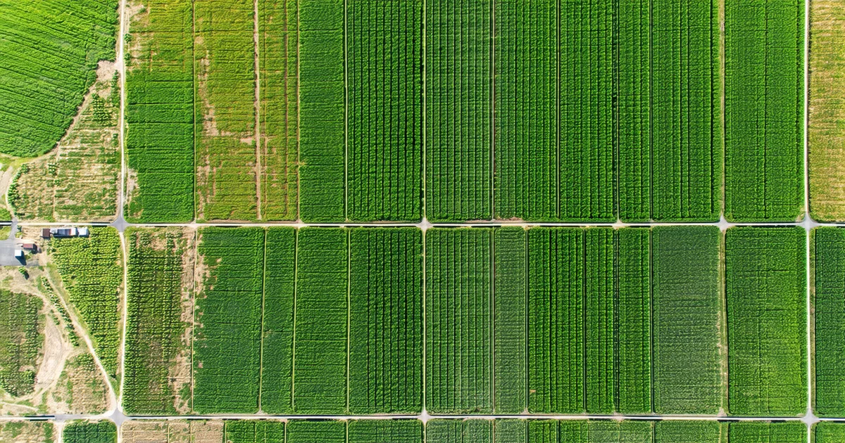
A field boundary polygon in GIS is a vector feature — a closed shape defined by vertices — that acts as a mask over raster satellite imagery. Every pixel whose centroid falls inside the polygon gets included in the field-level aggregate statistics (average NDVI, sum of NIR reflectance, canopy temperature estimate). Every pixel outside the polygon is excluded.
The aggregate statistics — average NDVI, peak-season canopy index, GDD-weighted biomass score — are what drive the yield model. They're calculated over the full polygon area. If 12% of your polygon area is a grassy road shoulder or a center-pivot corner that you don't farm, those pixels contribute their reflectance to the field average. In early season, when the crop canopy is still developing, a road shoulder with permanent grass cover will have consistently higher NDVI than adjacent bare-soil crop rows. That elevated NDVI signal from the non-crop area biases your canopy development estimates upward, making the field look healthier and more advanced than it actually is.
In late season, the same non-crop area — now fully green with perennial grasses while your crop canopy is beginning senescence — continues to inflate the field-average NDVI. The model interprets this as later canopy senescence and longer grain fill period than the crop is actually experiencing. The downstream yield forecast gets biased high on fields with significant non-crop polygon contamination.
Quantifying the Error: A Nebraska Example
In our 2023 field dataset from Buffalo County, Nebraska, we reviewed nine fields where our model had forecast errors exceeding 20 bu/ac at the R1 stage. We looked at the boundary polygons for those fields and compared them against Sentinel-2 early-season imagery (April, before crop emergence) where bare soil vs. non-crop vegetation distinction was maximally clear.
All nine of the high-error fields had measurable non-crop area inside their boundary polygons: grassed waterways, headland alleys, pivot corners in irregularly shaped fields, and one field where the boundary had been drawn to include a small windbreak along the north edge. The non-crop inclusion ranged from 6% to 23% of total polygon area, with a mean of 13.5%.
We re-ran the yield forecast for those nine fields using corrected boundary polygons — clipped to exclude the non-crop areas using a manual GIS correction. The MAE for those nine fields dropped from 21.4 bu/ac to 9.8 bu/ac with corrected boundaries. Same satellite imagery, same model parameters, same weather inputs — the only change was the polygon. That 11.6 bu/ac average improvement on nine fields came entirely from boundary correction.
We're not saying boundary errors are the only source of forecast error, or even always the dominant one. On fields with clean, accurate boundaries, other error sources — soil variability, weather uncertainty, irrigation event timing — dominate. But boundary quality is often the most fixable error source, and it's the one most under the grower's control.
How Boundaries Get Drawn Badly (And Why It's Not the Grower's Fault)
Most field boundary polygons in the precision ag ecosystem originated in one of three ways: digitized from aerial ortho imagery by the operator or their agronomist, imported from FSA Common Land Unit (CLU) data, or auto-generated by a field mapping app using GPS tracks from the planter or combine during the first season of use.
FSA CLU boundaries are designed around legal parcel geometry, not agronomic management boundaries. A quarter section with an irregularly farmed corner due to a pond in the southeast will still have an FSA CLU that covers the entire quarter section, including the pond. CLU-derived boundaries need to be manually cleaned before they're useful as satellite analysis masks.
GPS track-based auto-generated boundaries are better in theory — they should follow the actual planting path — but they depend on the GPS accuracy and stability of the equipment used, and they typically include the headland turn rows at full width even if the headlands are planted differently (or not planted) compared to the main field body. A headland that was planted to a cover crop or was left fallow for waterway establishment will contaminate the satellite signal for the main field if it's included in the same polygon.
The Resolution Comparison That Illustrates the Point
Consider two scenarios for a 160-acre field in Iowa with an irregular northwest corner containing a grassed waterway (approximately 11 acres of the total 160).
Scenario A: Sentinel-2 10-meter imagery, precisely drawn boundary polygon clipped to exclude the 11-acre waterway. The analyzed area is 149 acres of crop, with 10-meter pixel resolution and approximately 600 analyzed pixels at peak season.
Scenario B: 3-meter imagery from a commercial high-resolution constellation, sloppy boundary polygon that includes the full 160 acres with waterway. The analyzed area includes 11 acres of permanent grass inflating NDVI averages, with 17,800 analyzed pixels at 3-meter resolution.
Scenario A will give you a more accurate field-level NDVI signal than Scenario B, despite being at lower resolution, because the analysis area is actually representative of the managed crop. Scenario B has more pixels, but a meaningful fraction are measuring something that isn't your corn.
Practical Boundary Quality Workflow
The boundary quality review we run during grower onboarding has three steps. First, overlay all boundary polygons against April/early May Sentinel-2 imagery, before crop emergence, when the contrast between bare soil (NDVI 0.05–0.15) and permanent vegetation (NDVI 0.3–0.5) is easiest to see. Any polygon with visible non-crop inclusions flagged.
Second, we flag polygons with NDVI variance in the early-season imagery that exceeds a threshold consistent with uniform bare-tilled soil. A field that should be showing uniform dark bare soil but has a cluster of high-NDVI pixels in one corner is almost certainly including a waterway, windbreak, or permanent cover area.
Third, flagged polygons are sent back to the grower for confirmation or correction. The grower knows their field better than any satellite pass does. They know which corners have waterways, which fields have pivot corners, which edges run along roads. The correction usually takes 5–10 minutes per field with a simple polygon editing tool. The accuracy improvement on those fields is significant.
We do an automated boundary-quality scan on every new field set as part of season initialization. If a field passes the scan without issues, it moves directly into the model. If it's flagged, we prompt for review before running the first forecast. A forecast derived from a bad boundary isn't a bad model — it's a bad input. The model can't fix a polygon that includes 15% road shoulder. The grower can.
Sub-Field Zones and Management Boundaries
Field boundary precision also matters at the sub-field level for variable-rate management. If you're running variable-rate seeding or fertilizer prescriptions based on management zones defined within a field, the zone boundaries need to align with your actual soil type transitions and historical yield patterns — not with arbitrary grid cells or boundaries inherited from a different platform's default zone algorithm.
The best sub-field zone boundaries come from one of two sources: SSURGO soil map unit polygons (which represent genuine soil type transitions mapped by NRCS field surveys) or multi-year yield monitor data aggregated across 3–5 seasons. Either way, the zone boundary geometry matters. A variable-rate seeding prescription applied to a zone that doesn't actually correspond to a real soil transition is just rate variation applied to a fiction. The satellite data tells you where the crop is expressing different vigor — but it can't tell you whether that boundary is a real management boundary or a legacy artifact of how the polygon was drawn five years ago.